Nature heals.
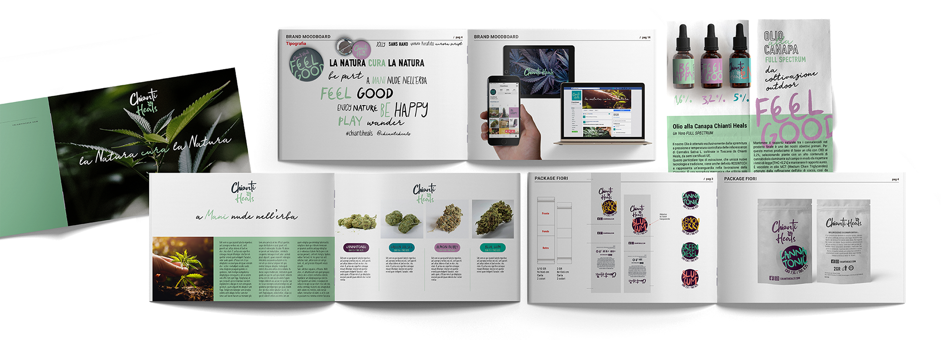
Chianti Heals was born as a radical gesture before it became a business: a life choice that takes shape in the biodynamic cultivation of hemp and in a short, transparent supply chain where every transformation — oils, creams, flowers — maintains a direct connection to the land. At its foundation, a solid scientific expertise that guides both the product and the narrative, avoiding rhetorical drift and building trust through clarity and consistency.
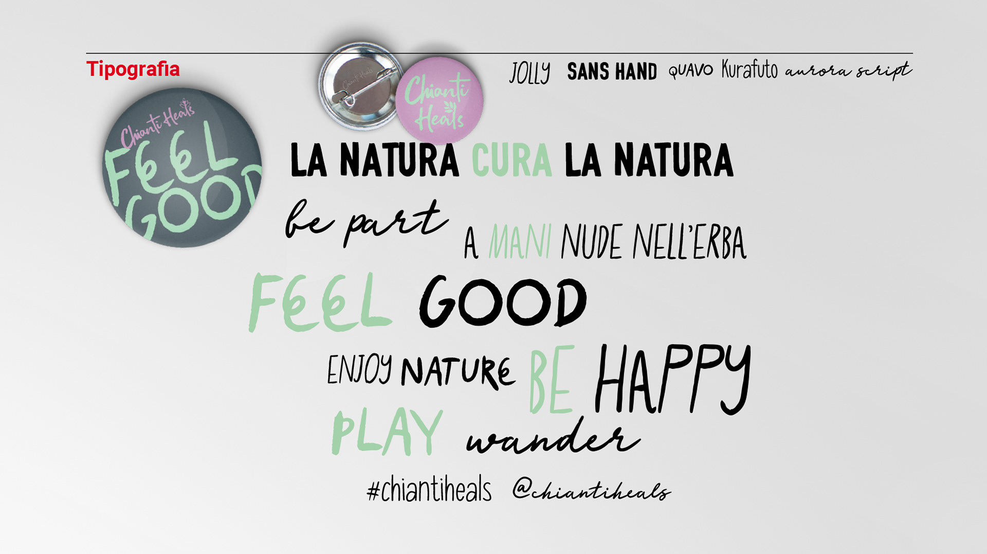
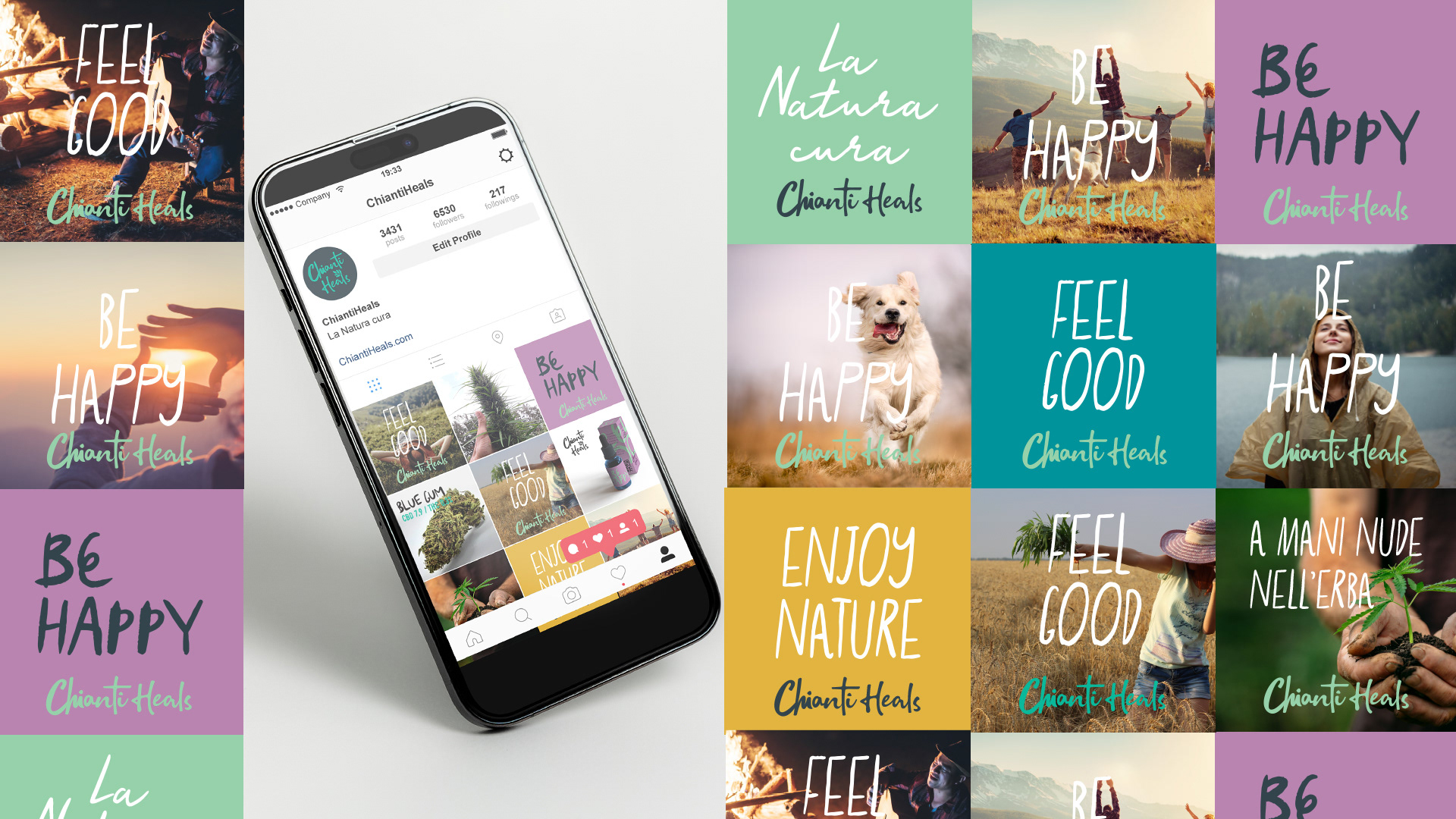
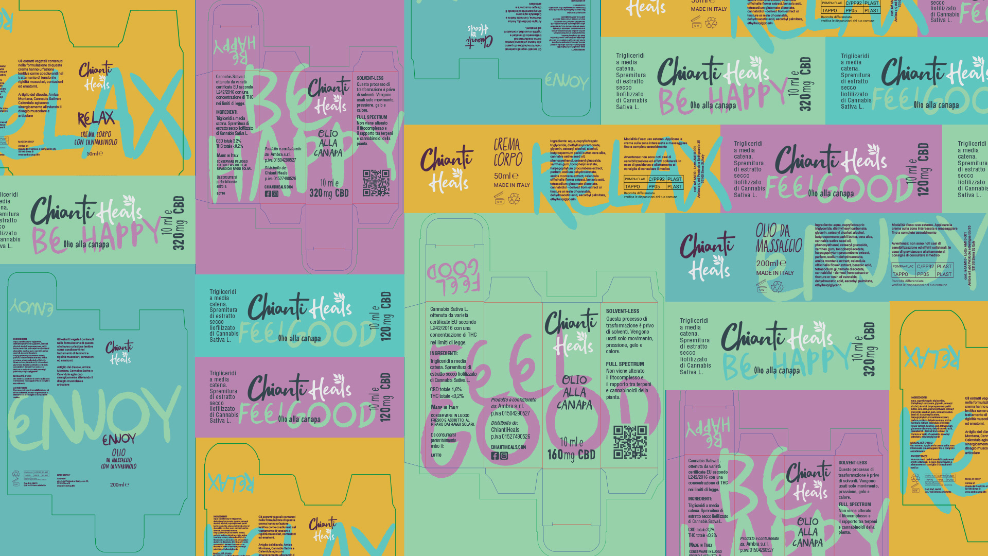
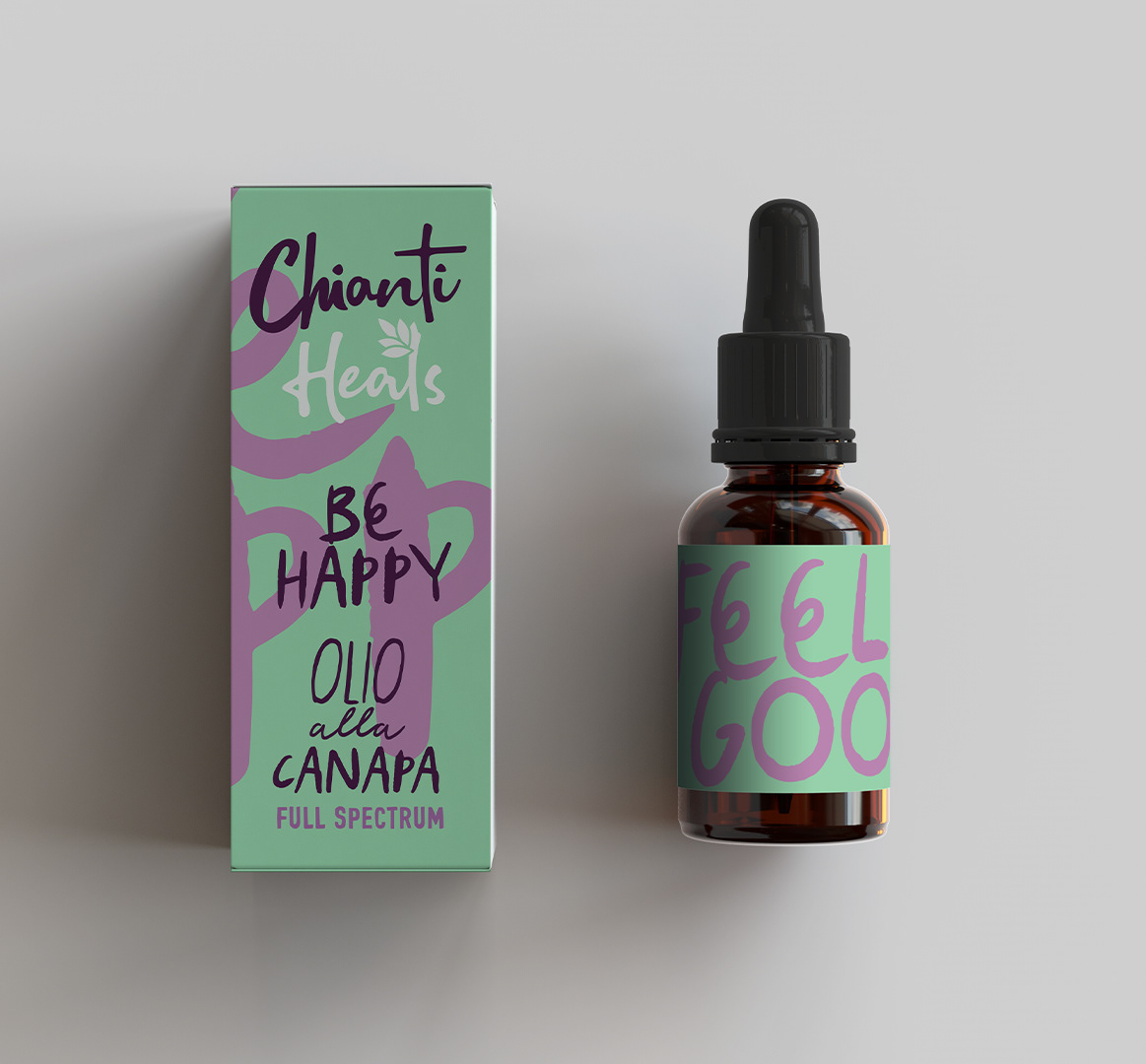
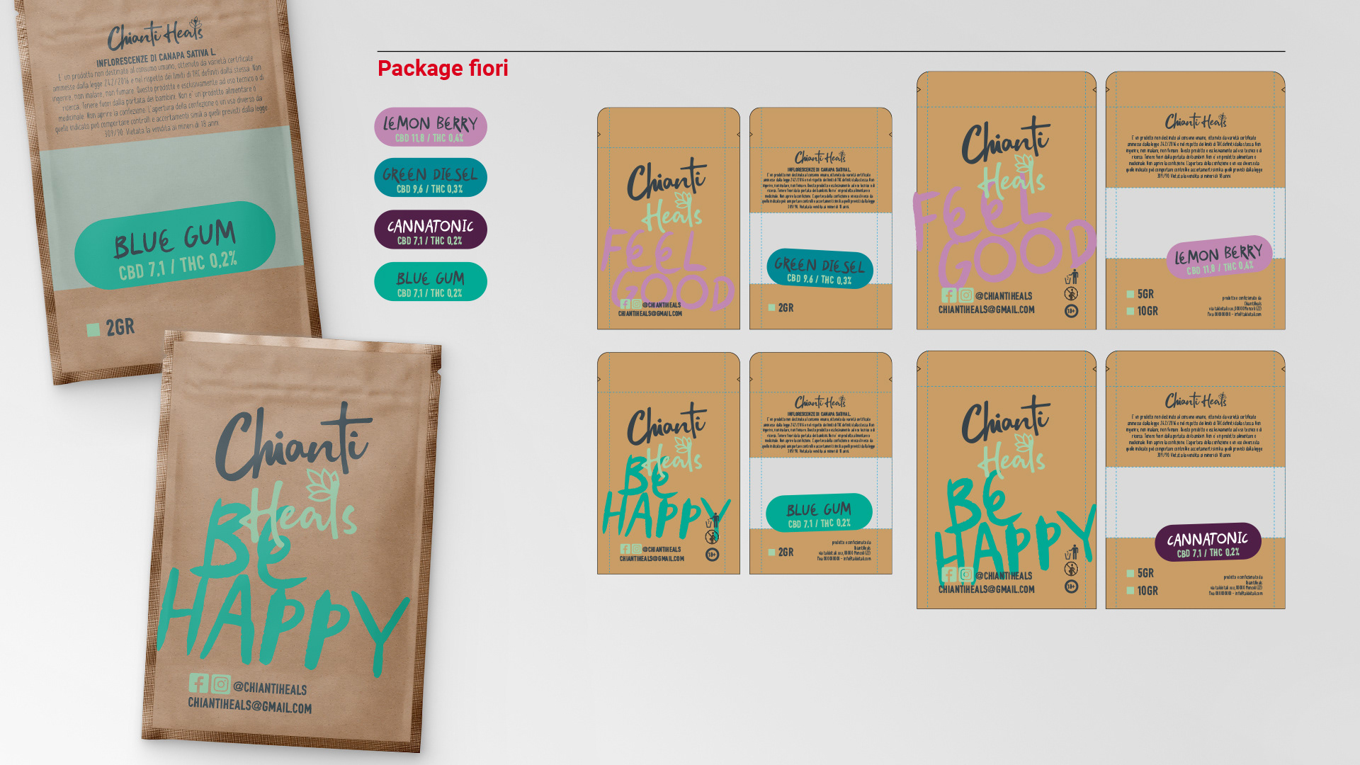
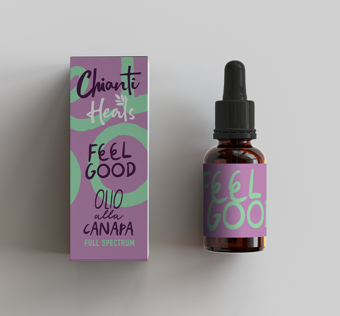
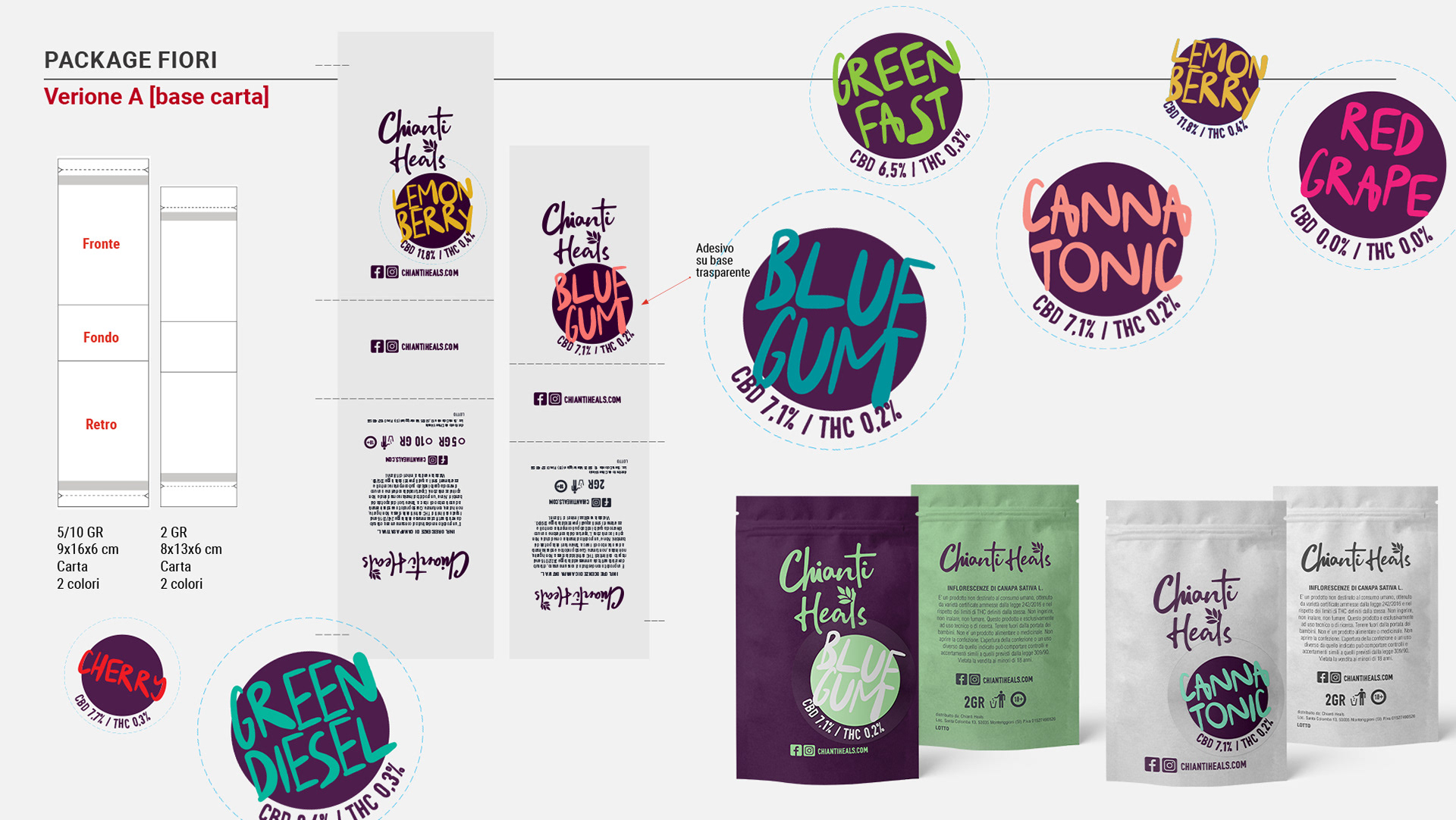
The visual identity translates this attitude into an immediate, vital language: saturated palette, pop tone, expressive typography and direct messages that give wellness an accessible, non-dogmatic dimension. A system designed to be fluid and recognisable across every touchpoint — packaging, social, digital — always maintaining the same energy: concrete, instinctive, deeply rooted in nature.