Earth, table, community.
Demetra existed long before the brand: ten years of permaculture, food, workshops, and hospitality shaped by three families who met in Montalcino and chose to stay—to cultivate, to host, and to share. When the time came to give this world a voice, the design process could only begin with listening: to a vision already mature, authentic, and deeply rooted in both land and people.
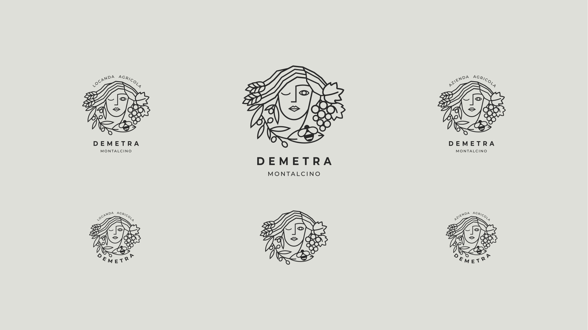
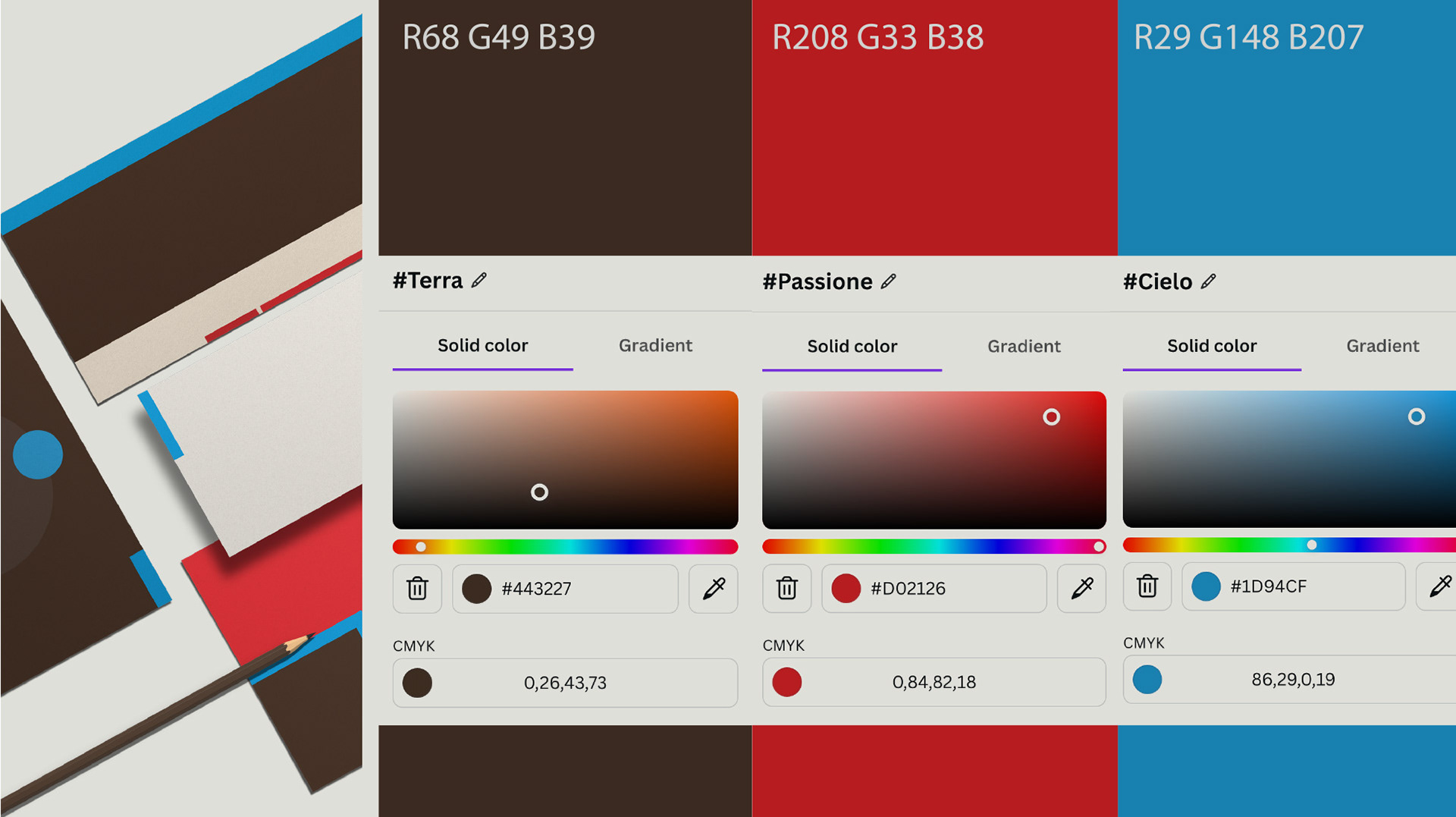
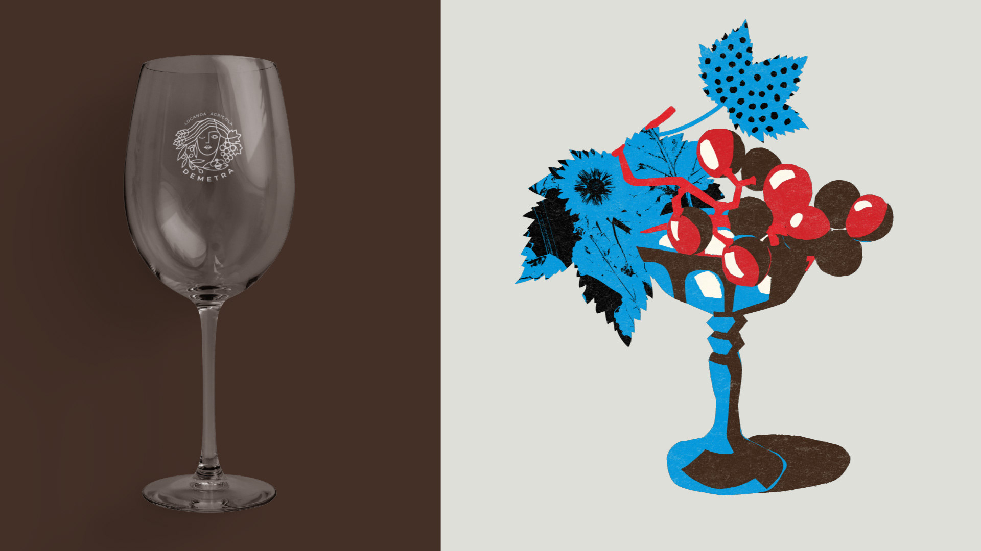
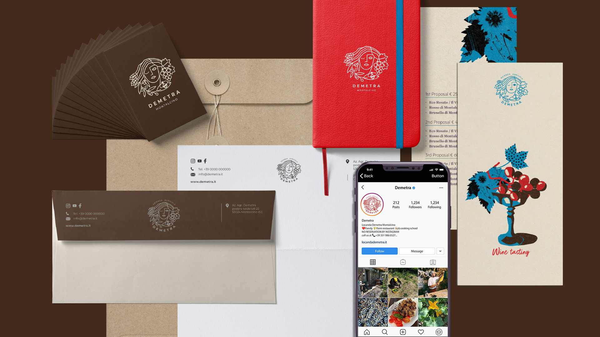
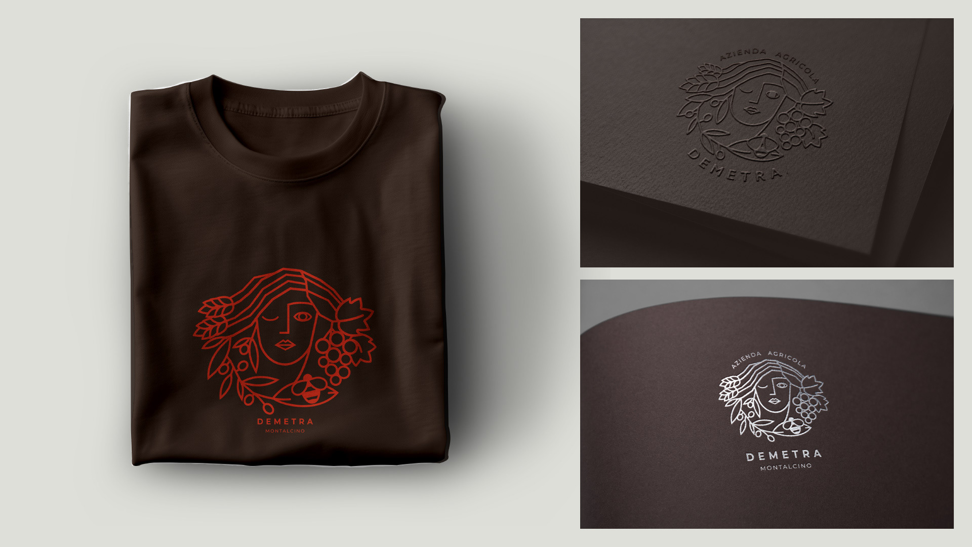
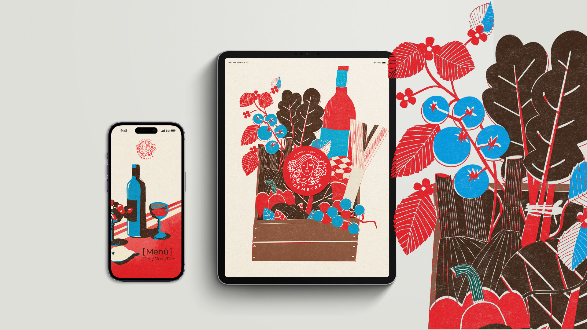
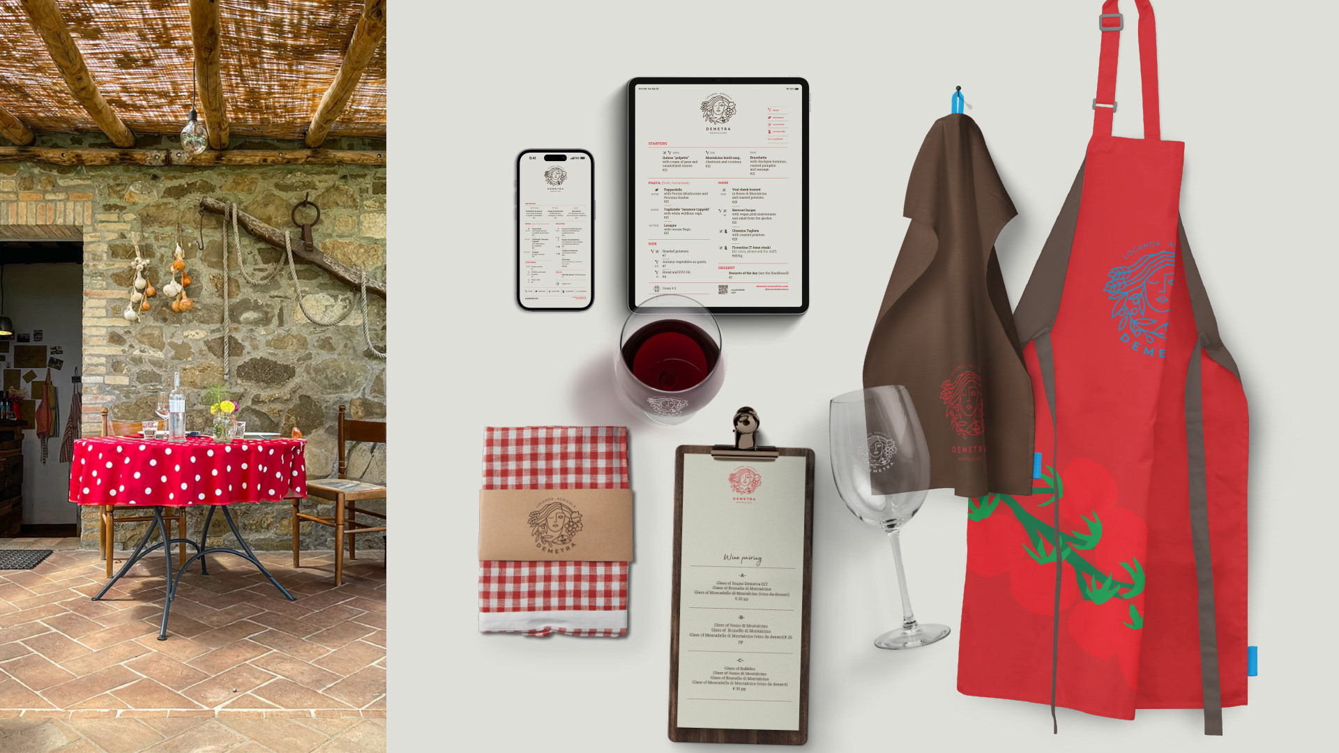
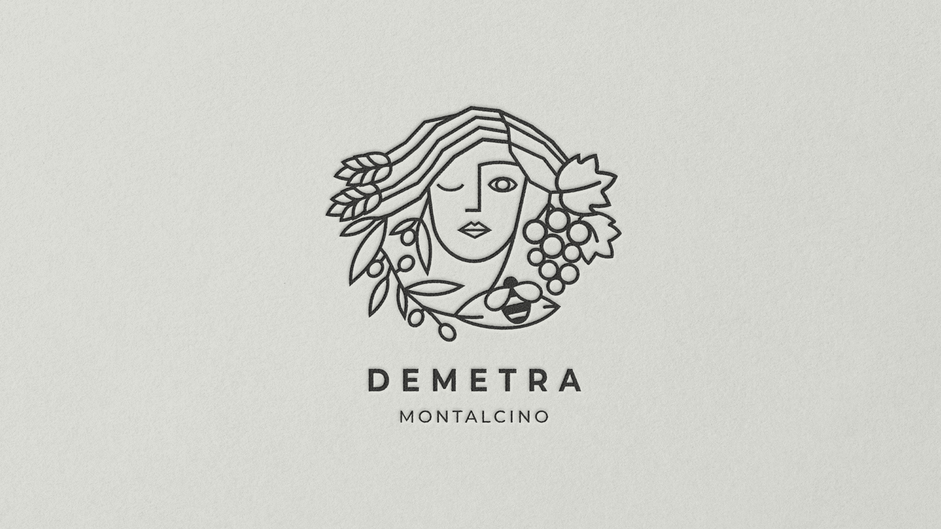
The logo takes the form of a female face carrying fruit, leaves, grapes, and olives within it—a contemporary linear reinterpretation of Demeter. For the wider system, we chose a visual language that is bold, warm, and intentionally informal, in harmony with the rustic, historic spaces that host the project without ever slipping into the folkloric.
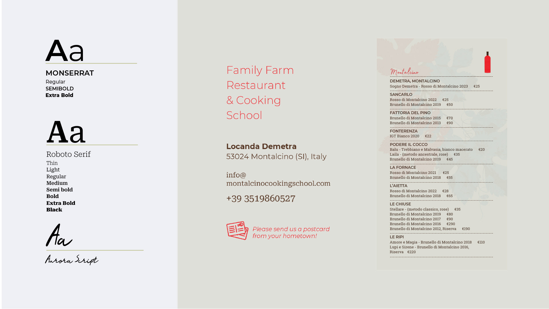
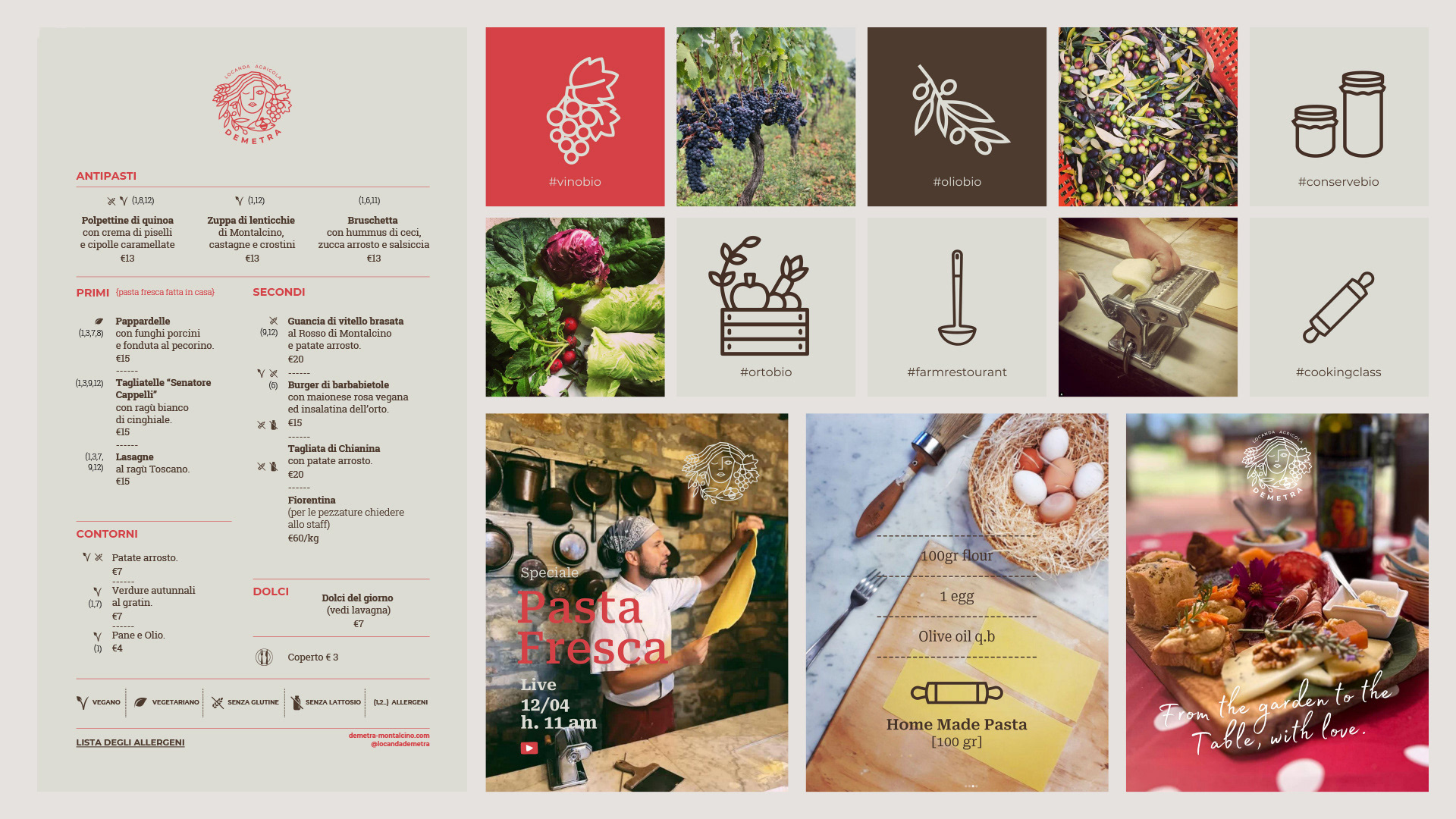
Demetra offers experience before product, and the visual language reflects this priority: simple, replicable, and designed to help the team document and share each moment—a workshop, a harvest, a shared lunch—with the same natural ease with which it is lived.