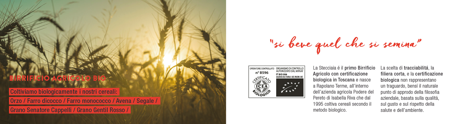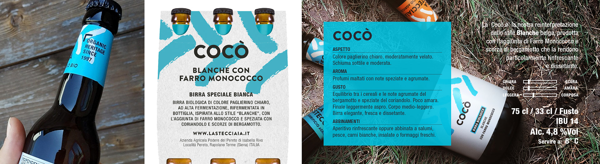
Si beve quel che si semina.
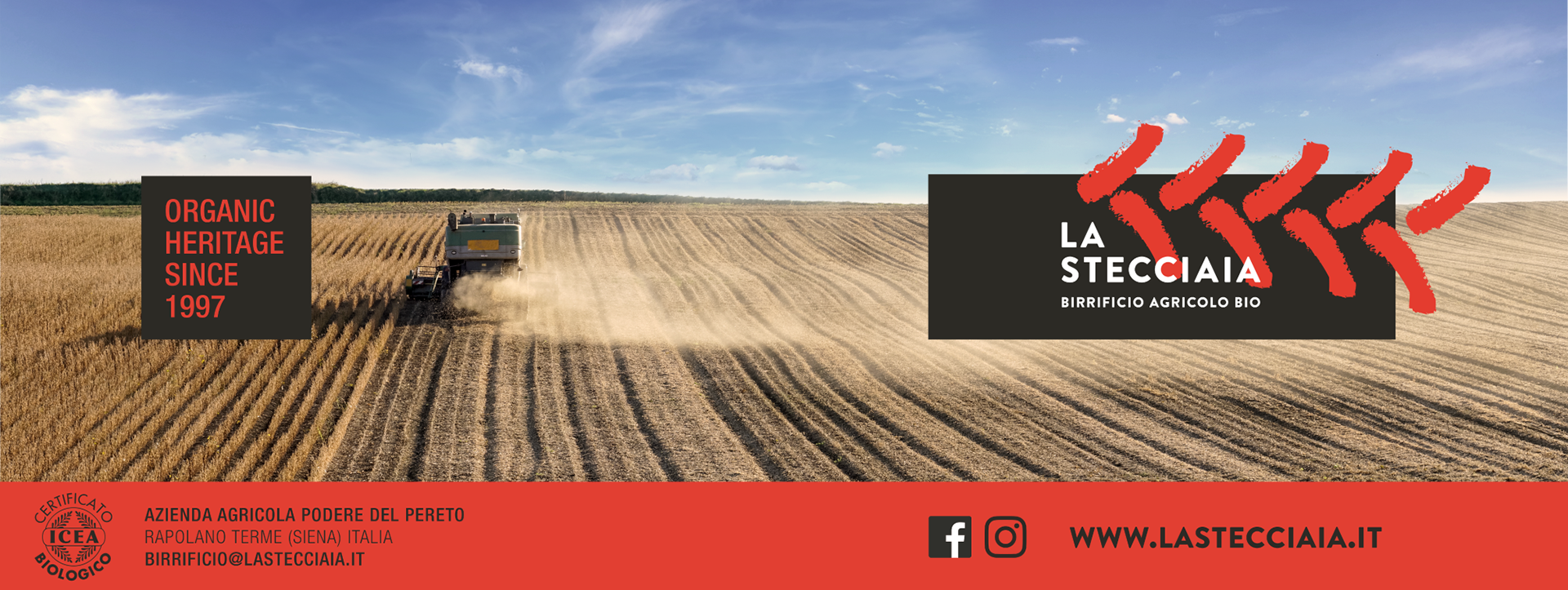
The tagline came on its own, after a long conversation with Stefano, the brand's founder and master brewer, about his production method: from grain to glass, a fully controlled, organically grown supply chain — by vocation before certification. La Stecciaia is Italy's first organic agricultural brewery — the grains, the hops, the land: everything in-house, everything with care. When a product has this clarity of vision, design has nothing to do but stand beside it without overpowering it.
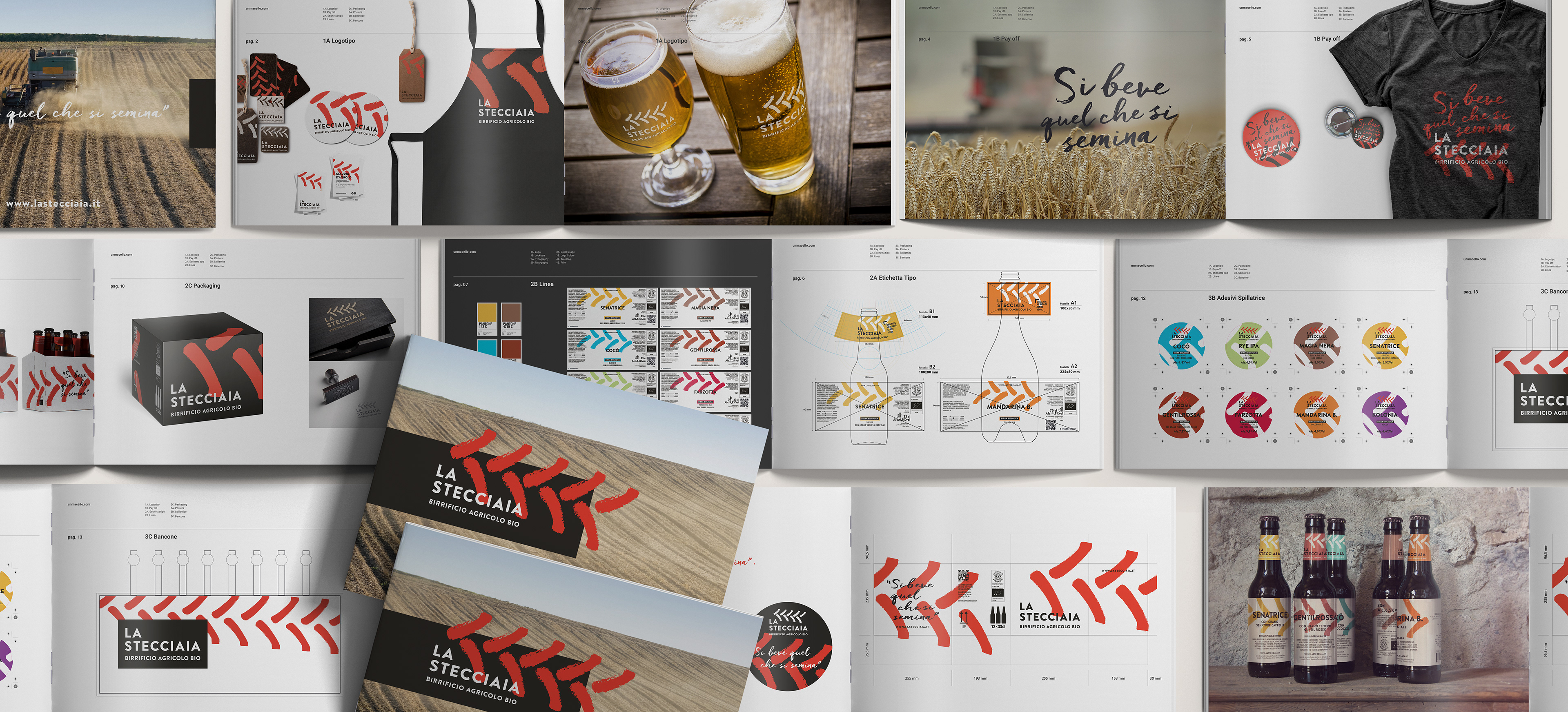
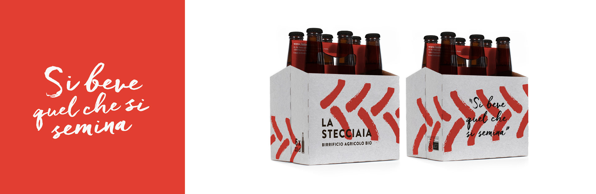
The rebrand, built around the brand's entry into organic and gourmet distribution, starts from a counter-current choice: whiteness, simplicity, clean typography. No concessions to the wow-effect graphics that dominate the craft beer world — La Stecciaia isn't targeting the pub crowd, it's targeting connoisseurs of classic products made with modern standards. The central graphic mark — the tractor's trace on the soil, the straw stalks left after threshing — becomes a system: recognisable, colour-adaptable across a line of ten beers, effortlessly scalable. A complete style guide accompanied the rollout, from communication materials to merchandise to product packaging.