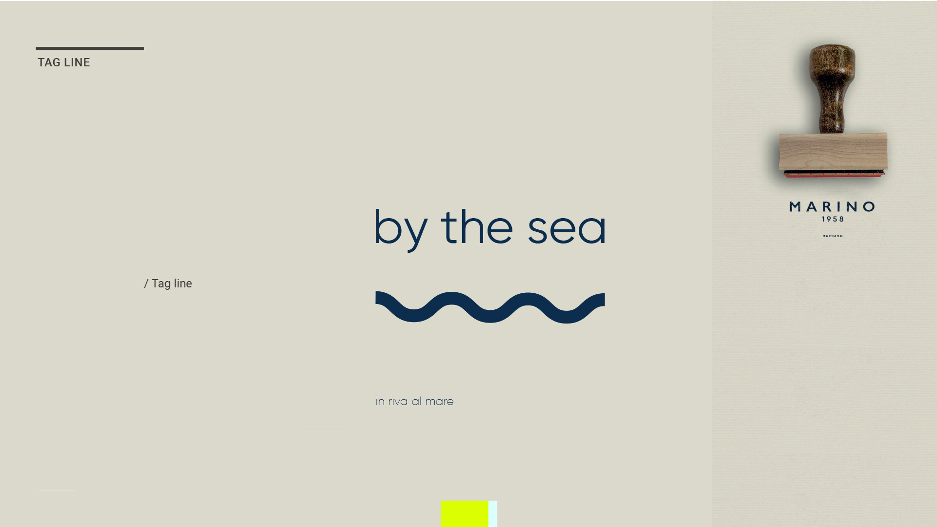
By the Sea
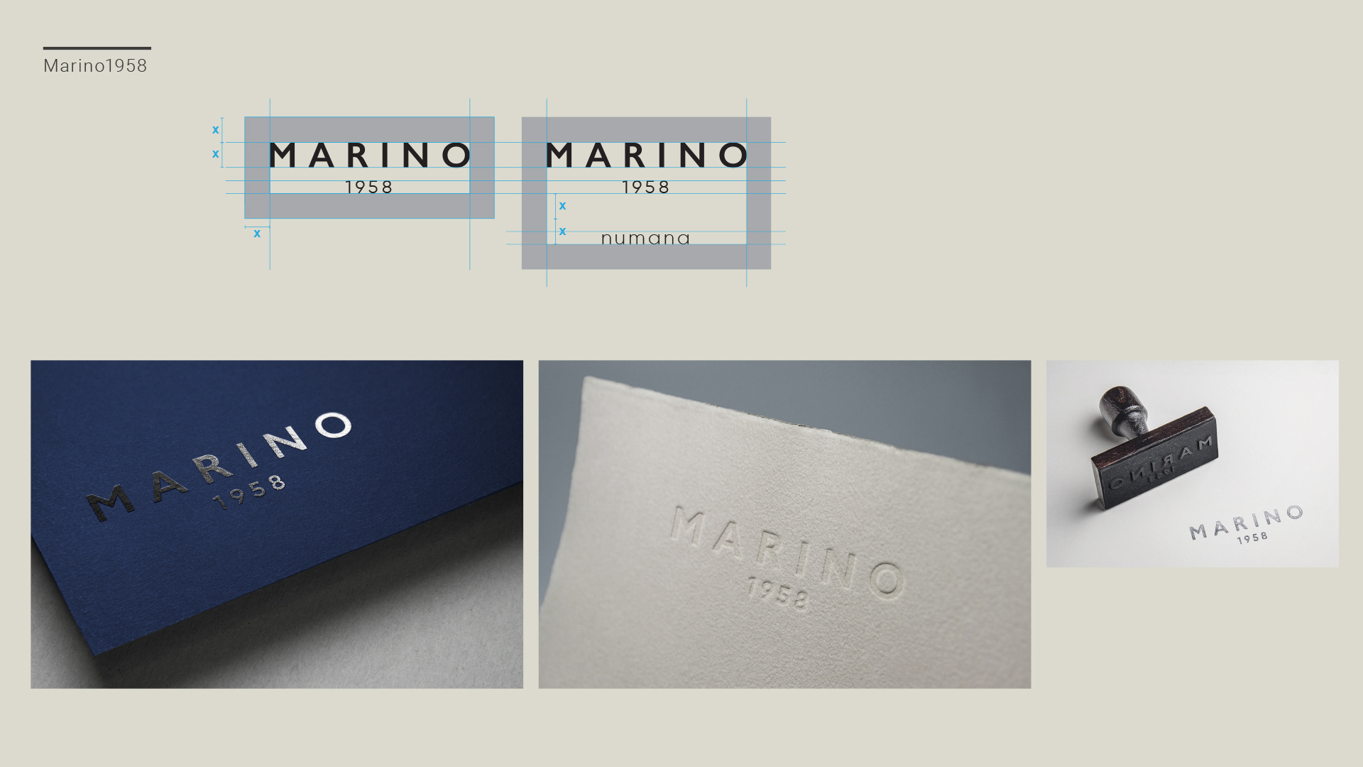
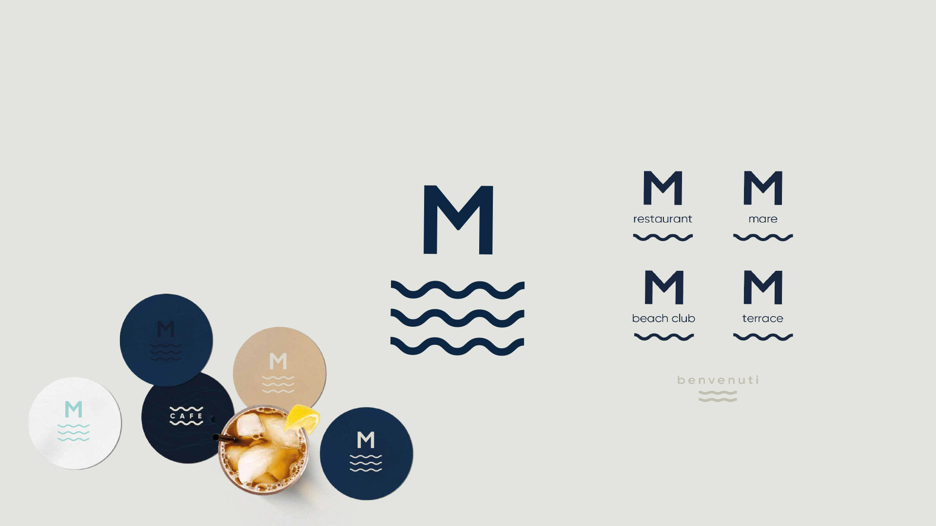
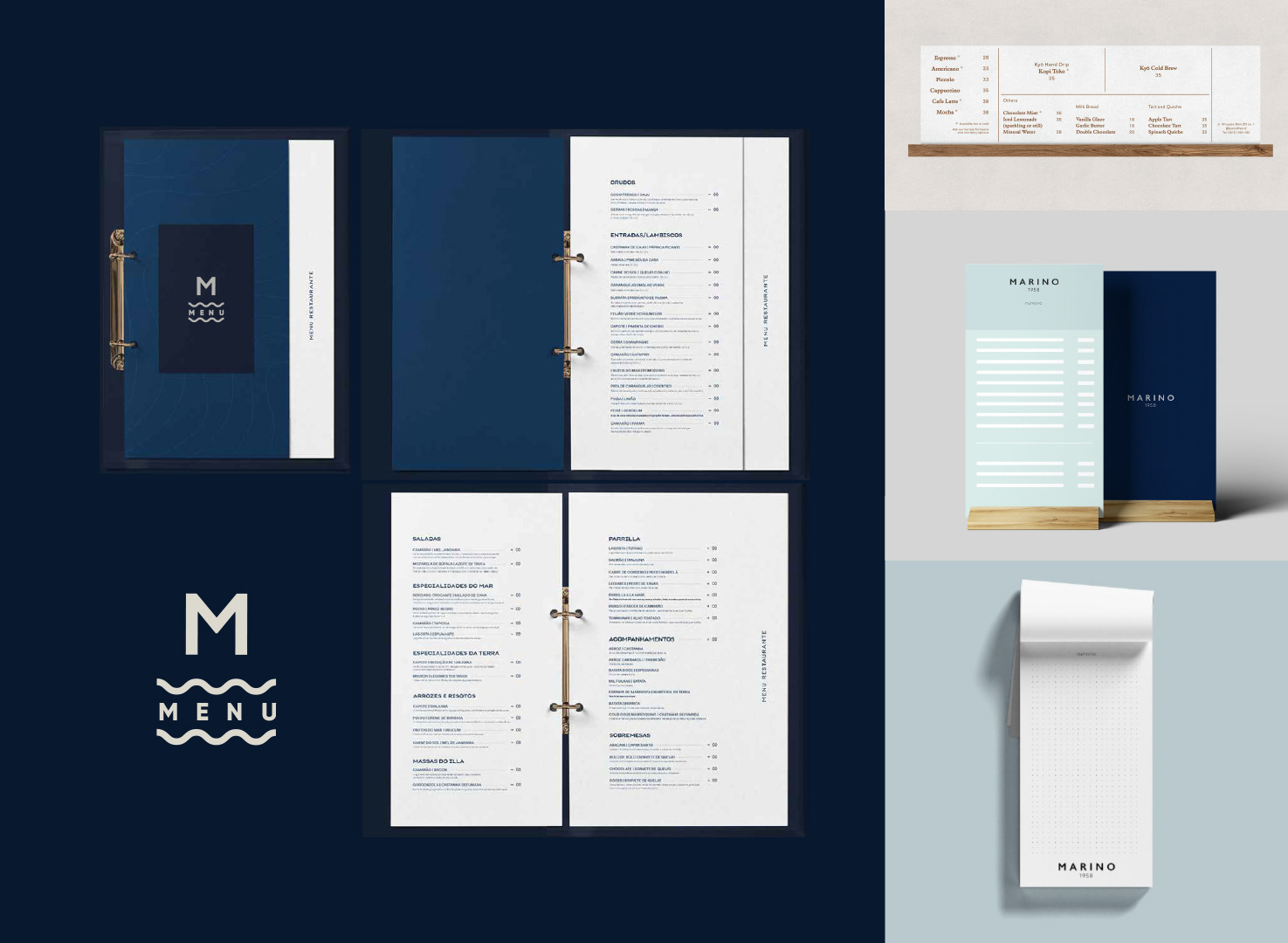
A rebrand through subtraction: nothing unnecessary, everything exactly where it belongs. Marino 1958 is redefined through an essential visual language built on rhythm, restraint, and precision. The typographic mark is anchored to the founding year, while the wave line becomes a minimal, recurring identity element.
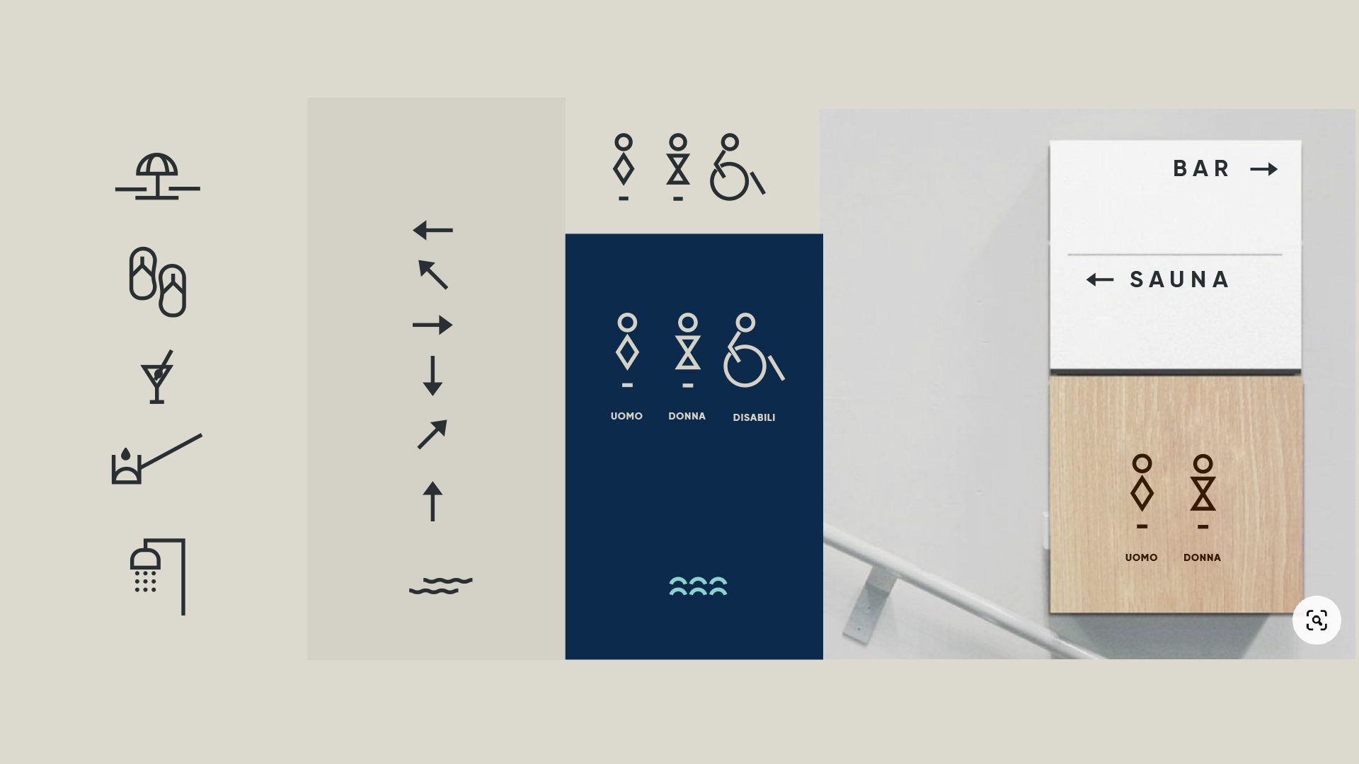
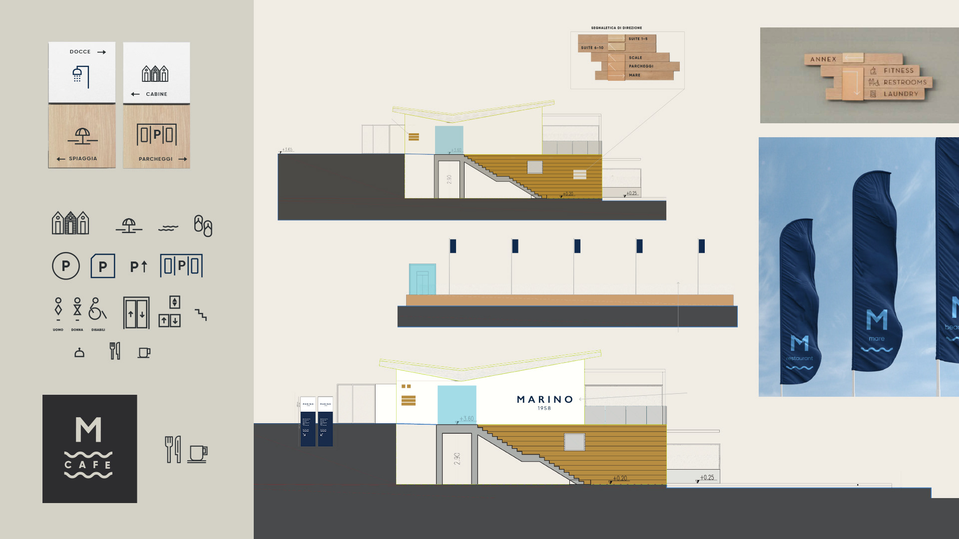
The repositioning elevates the brand without sacrificing its welcoming nature, translating the idea of by the sea into an experience that feels measured, elegant, and free of excess. The identity extends seamlessly into the space itself: materials, tones, and volumes are conceived in dialogue with the visual system, creating a unified environment where graphic design and architecture share the same grammar. Every application—from signage to printed matter—follows a rigorous set of rules that reinforces the perception of quality while fulfilling its function with complete ease.
Art Direction, Concept, Tagline, Studies: Arianna Biasiolo, Francesca Gualtieri | Graphic Design, Icons and Signage: Anna Ferro