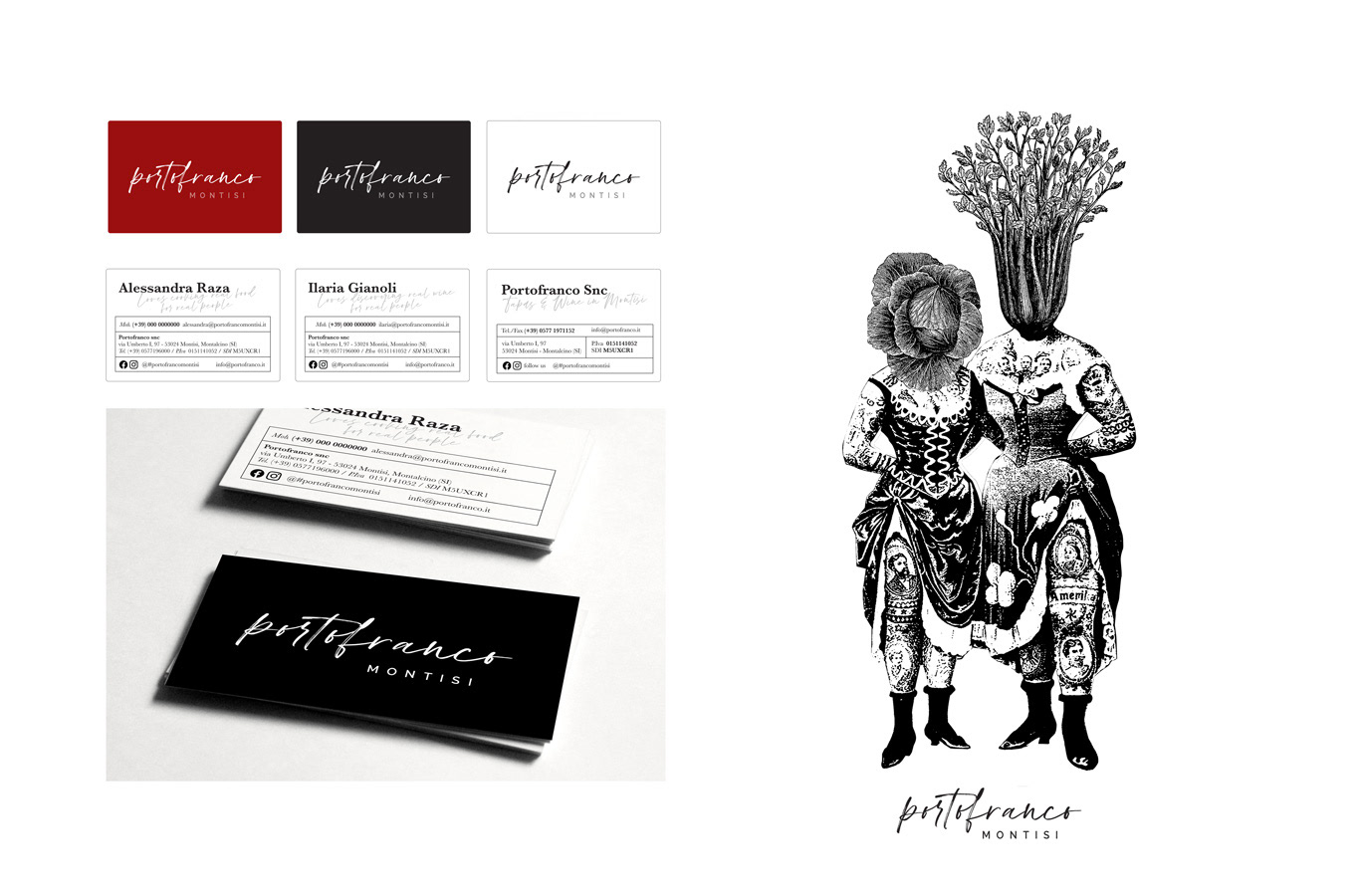

In the heart of Val d’Orcia, a boutique shaped around wine and the culture of slow living.
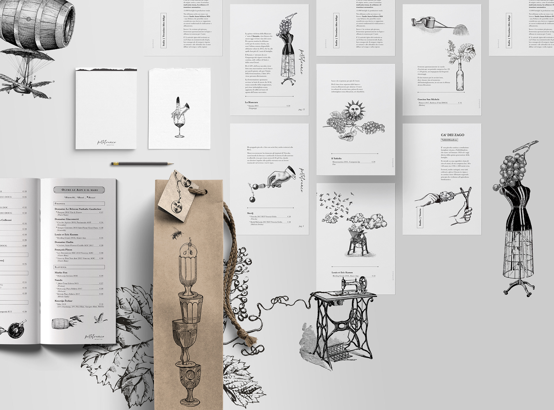
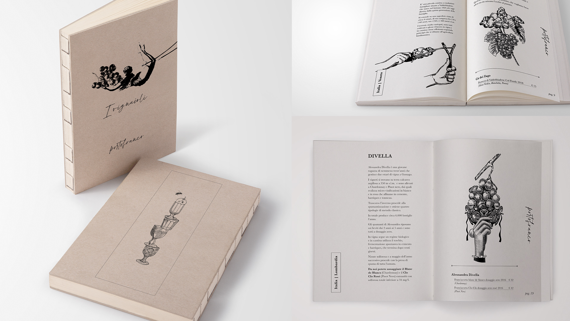
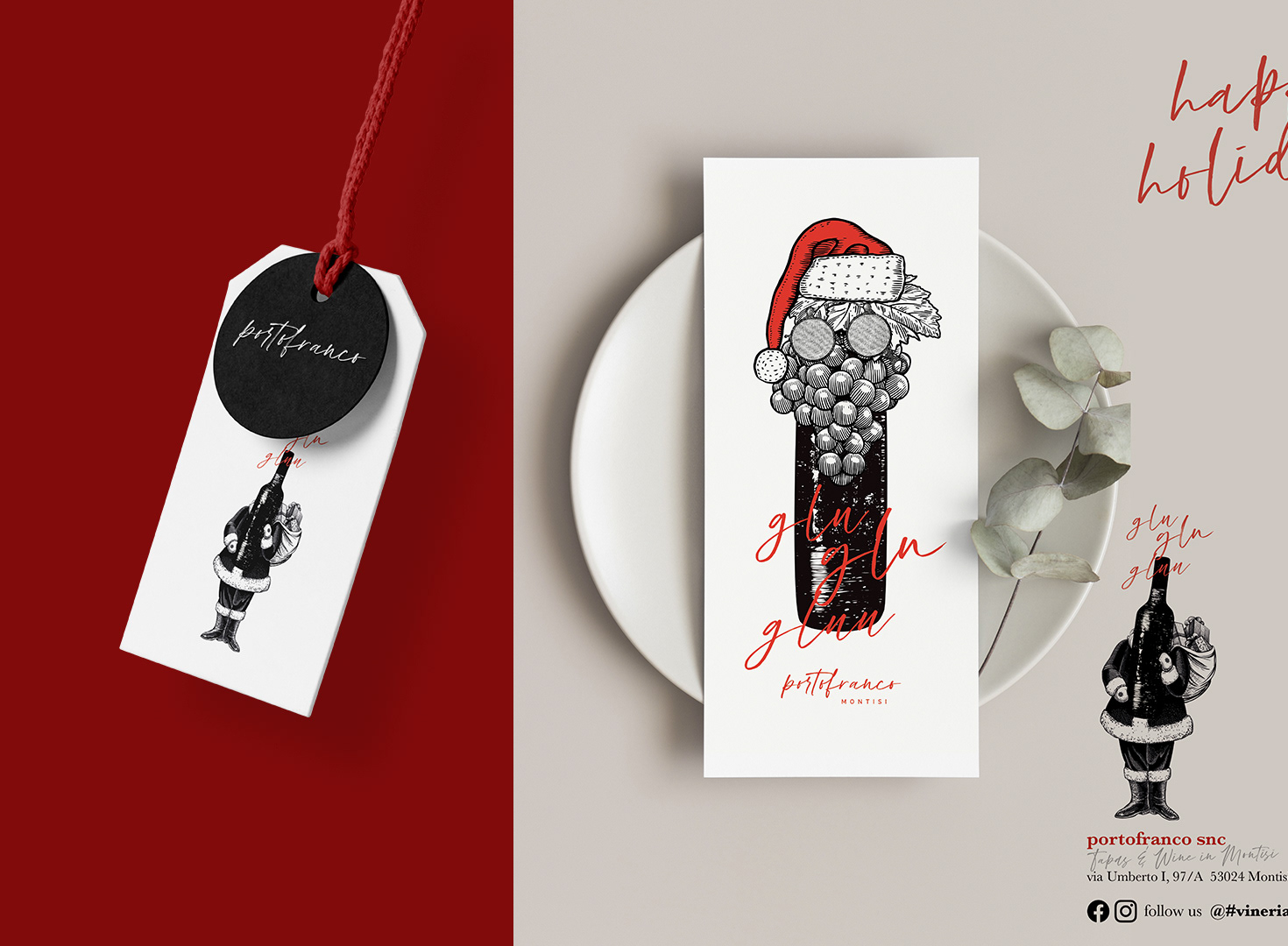
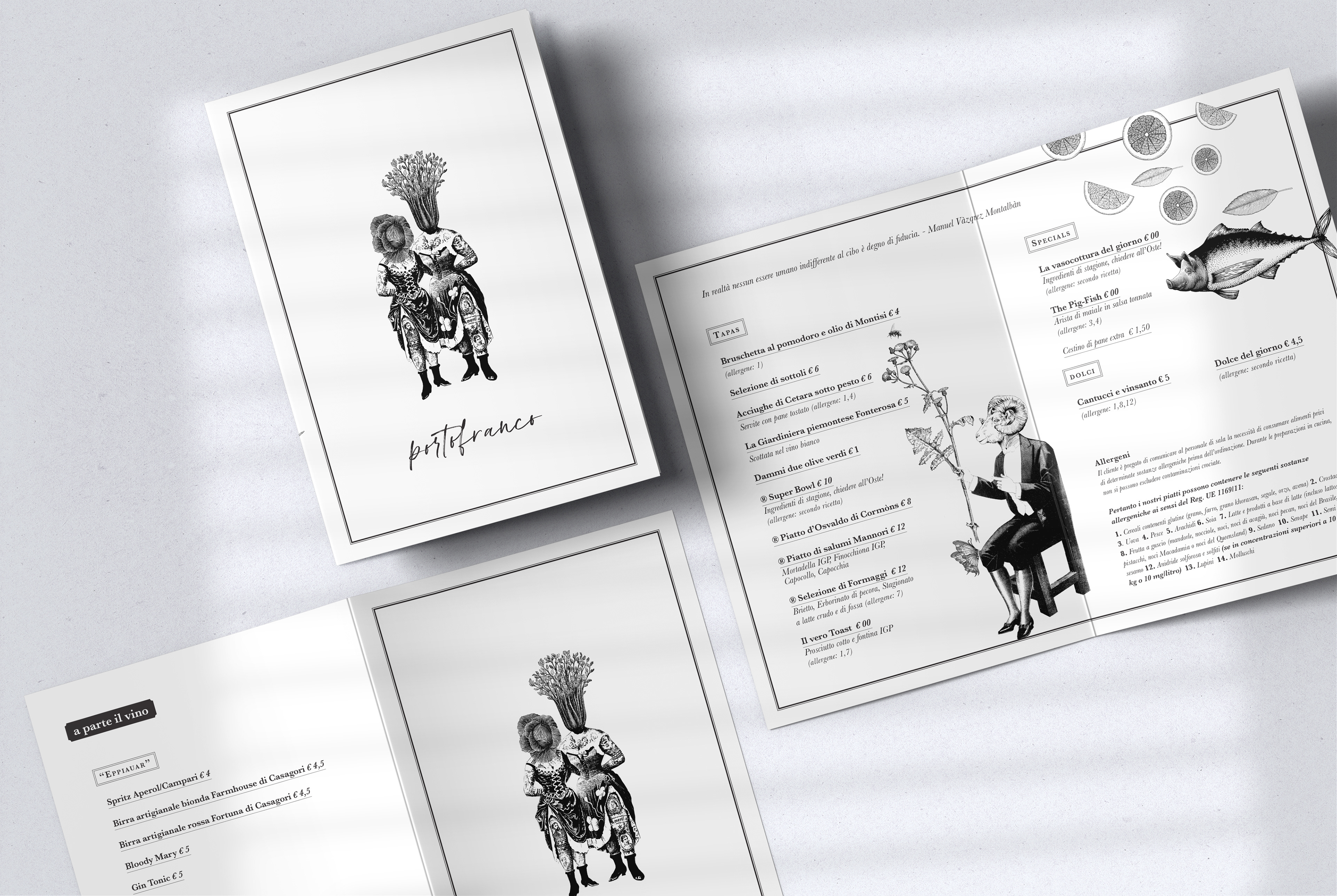
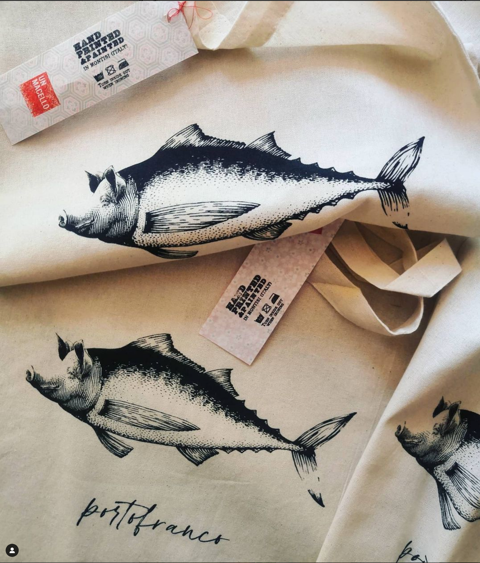
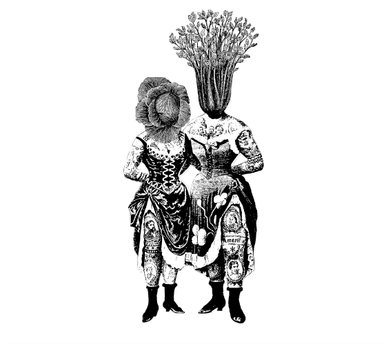
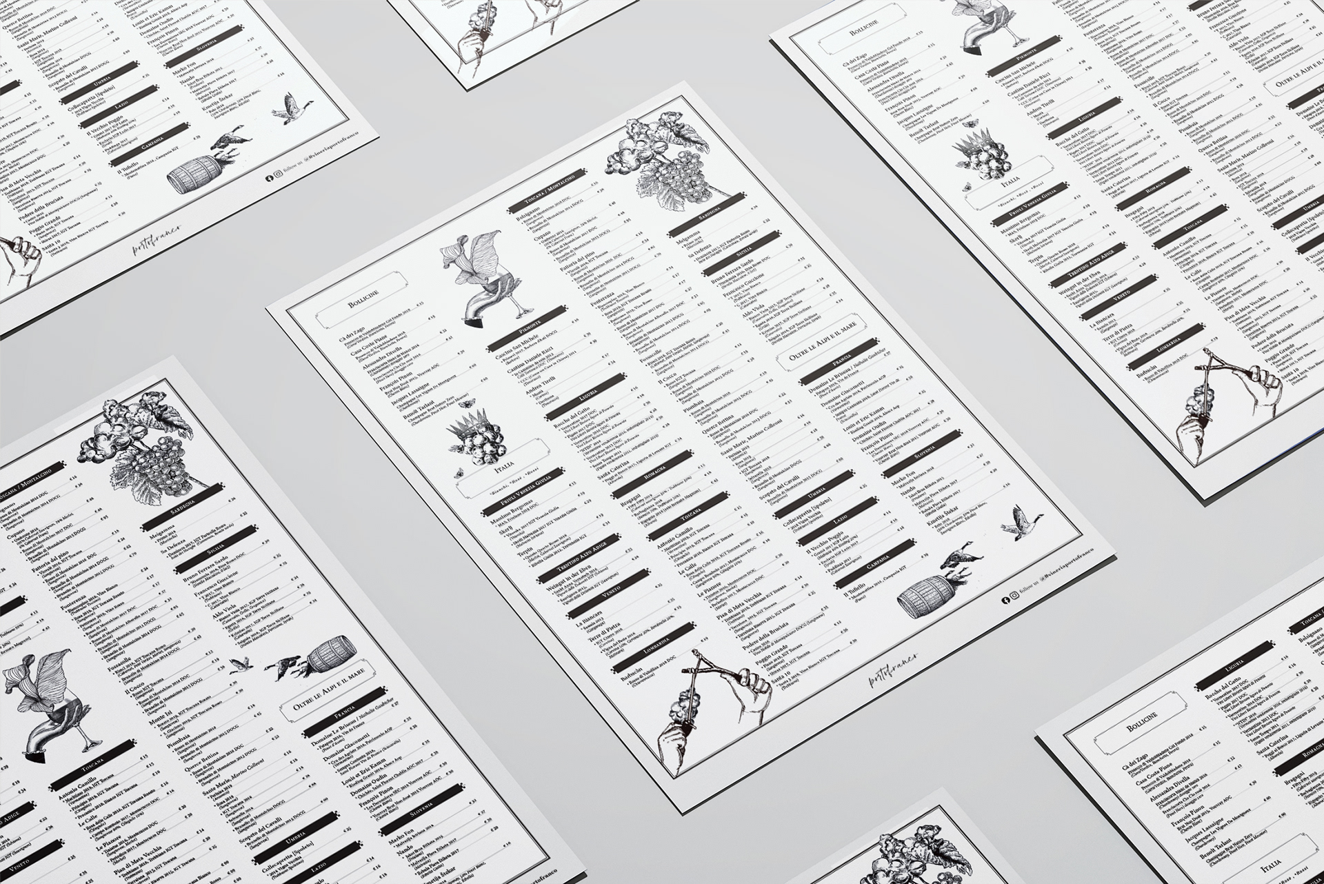
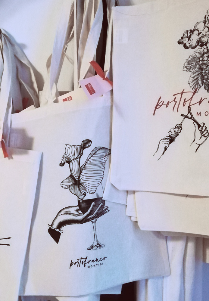
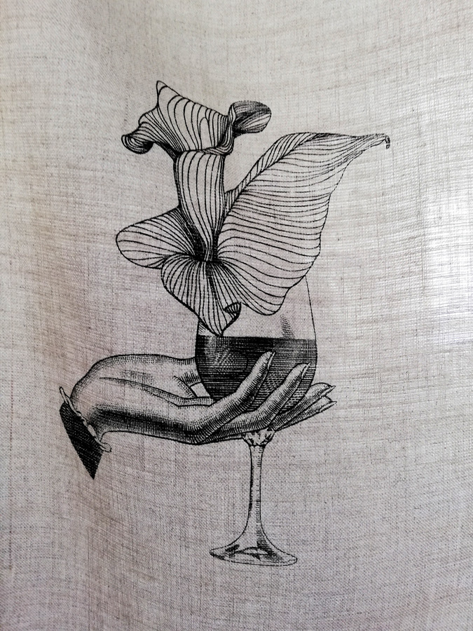
More than an identity, Portofranco is conceived as a place: open, fluid, and inherently relational. Both a destination and a narrative framework, it uses wine as a catalyst for connection, discovery, and new geographies of taste. The typographic mark acts as a signature—intimate and human—placing people before product, while the wider visual system remains deliberately frank, direct, and free of ornament, echoing the natural wines it curates.
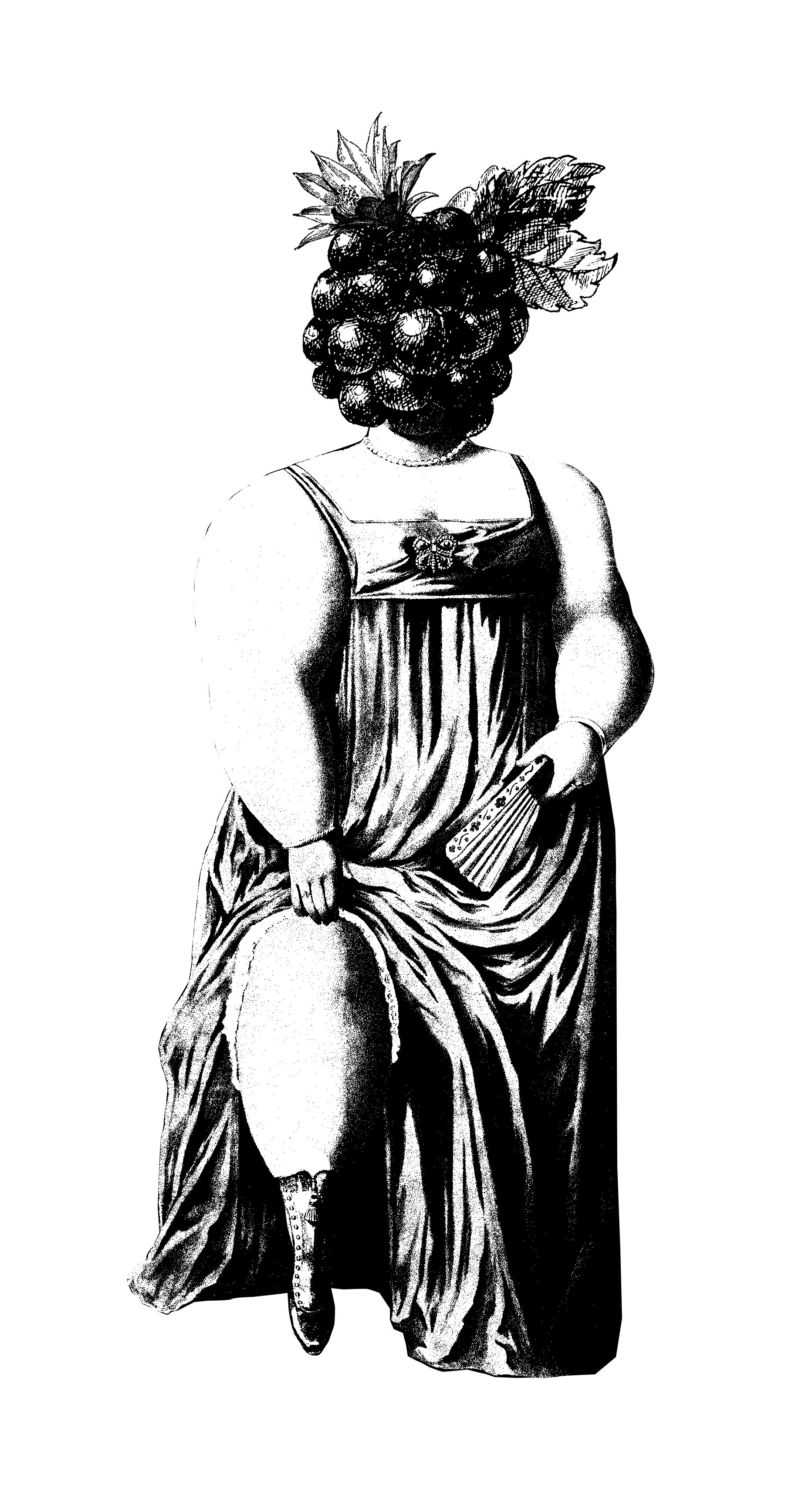
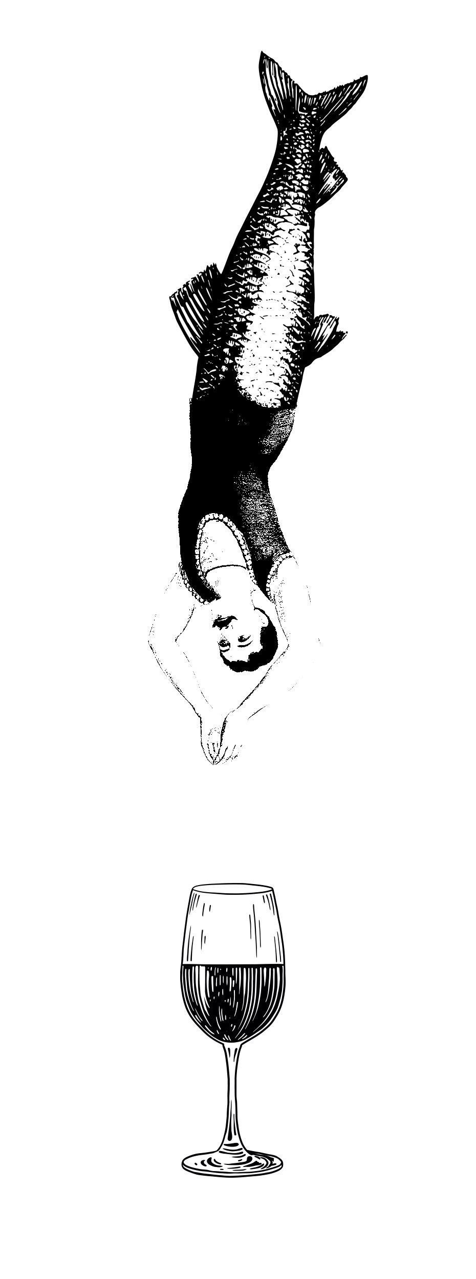
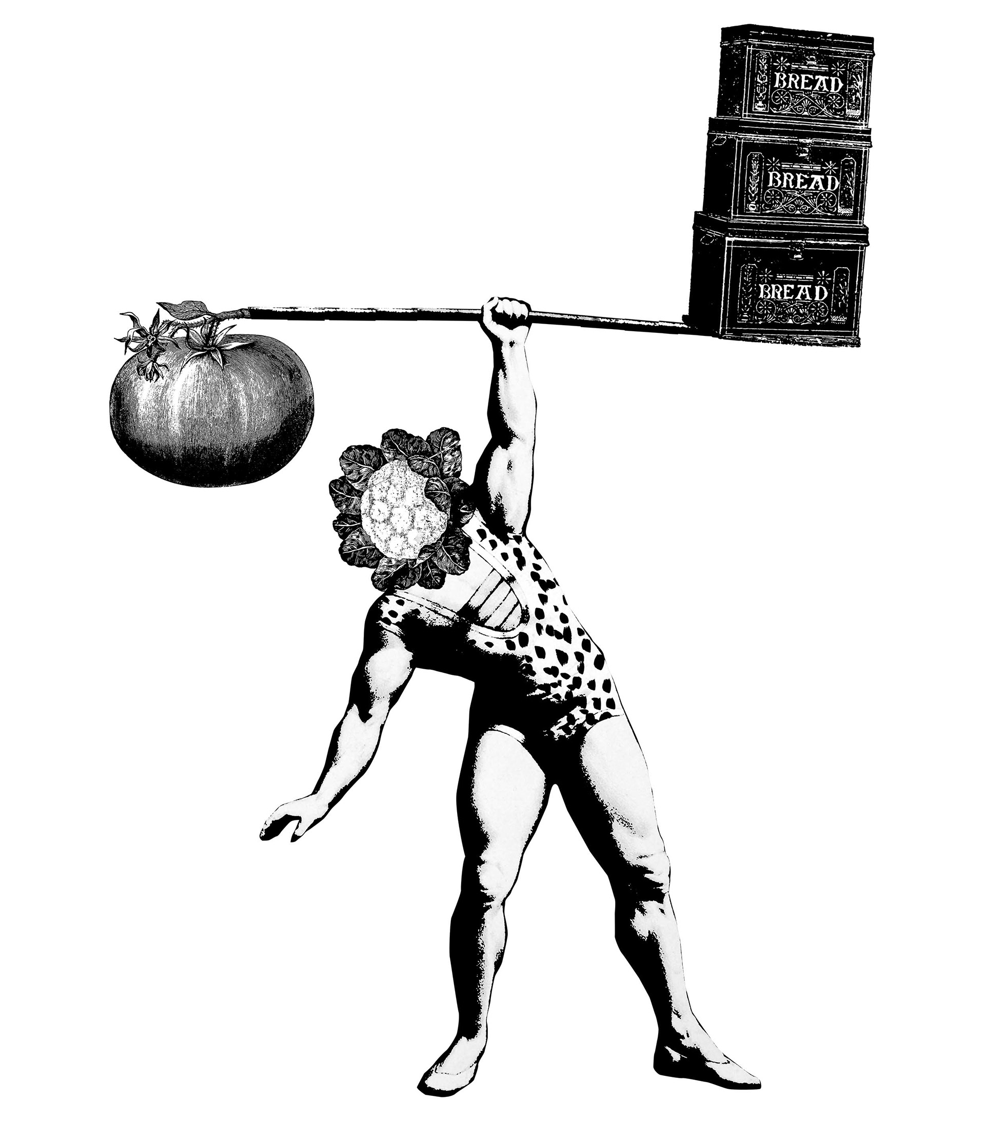
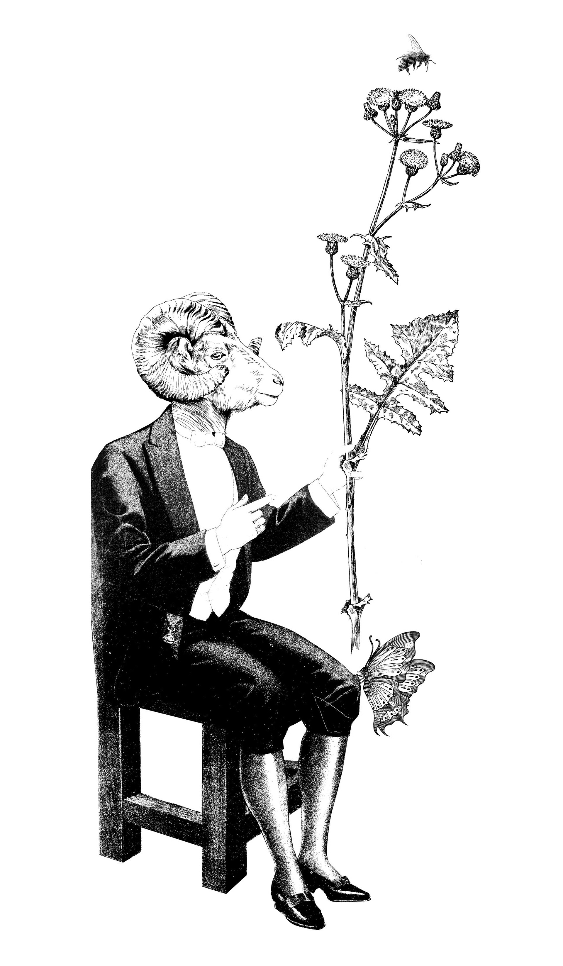
The illustration language inhabits a space between archival engraving and contemporary gesture. Surreal figures, botanical motifs, and animals intertwine with human forms to create layered, witty micro-narratives that reframe the visual codes of local country living without slipping into nostalgia. The result is a distinct, authorial aesthetic: rooted yet open, crafted yet self-aware, sophisticated with a lightness that never takes itself too seriously.